Web | Design | Branding
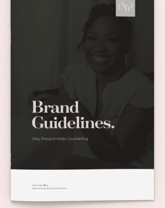
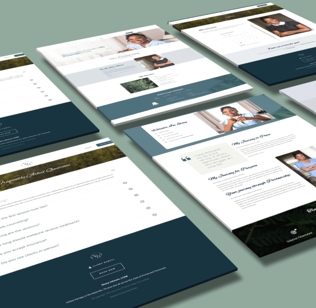
Very Present Help Counseling is an online therapy and counseling service that specializes in EMDR and CBT treatment solutions. Ebony Johnson, a licensed therapist featured on Psychology Today, was in need of her own online space where she can advertise her services, book clients, and build a recognizable brand.
Goals
- Design a logo and branding
- Wireframe and plan print layout
- Integrate established style and appropriate imagery
Identity
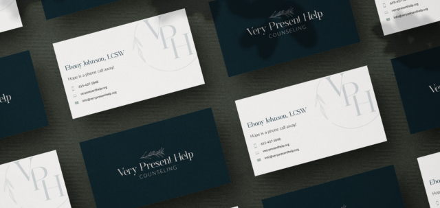
My client requested a professional logo that still felt feminine. Her desired aesthetic was described as modern, delicate, and slightly traditional. Her brand is holistic and spiritual healing so she wanted to incorporate nature and other elements that convey "healing". I collaborated with DCJ Media to finalize an identity that represented all those descriptions.
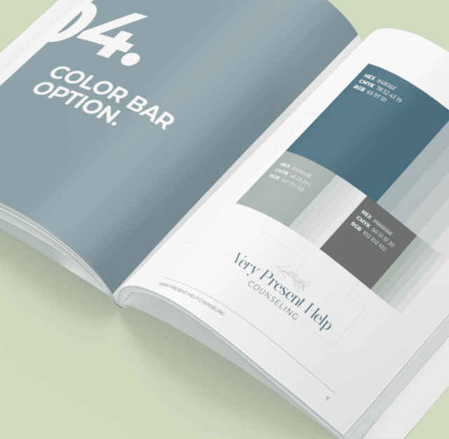
Yankees Blue
Deep Space Sparkle
Morning Blue
Pastel Gray
Style Guide
My search took me to several other therapist websites including Psychology Today and numerous other online therapy services.
The targeted audience for client's business included women and children. Her faith-based approach may also attract those who prefer a more spiritual approach to therapy. Additionally, my client is a minority amongst other independent therapists in her industry so it was important that I optimized her SEO to stand to those viewers.
The keywords that would guide my search as I assembled my board included the following:
- Calm
- Healing
- Presence
- Peace
- Help
- Care
- Patience
- Spirituality
Rostemary - Regular
Aa Bb Cc Dd Ee Ff Gg Hh Ii Jj Kk Ll Mm Nn Oo Pp Qq Rr Ss Tt Uu Vv Ww Xx Yy Zz
Lato - Light
Aa Bb Cc Dd Ee Ff Gg Hh Ii Jj Kk Ll Mm Nn Oo Pp Qq Rr Ss Tt Uu Vv Ww Xx Yy Zz
Main Headers
Rostemary is a strong serif that emphasizes curves thus giving
it a feminine appeal while still conveying a sense of authority.
Secondary Header and Tagline
Lato was used as an accent or tagline for the wordmark logo. Lato brings balance with a sense a minimalism.
Logo Variations
Badge - Outlined
Badge - Filled
Badge - Mono
