New Bethel Tampa
Web Design
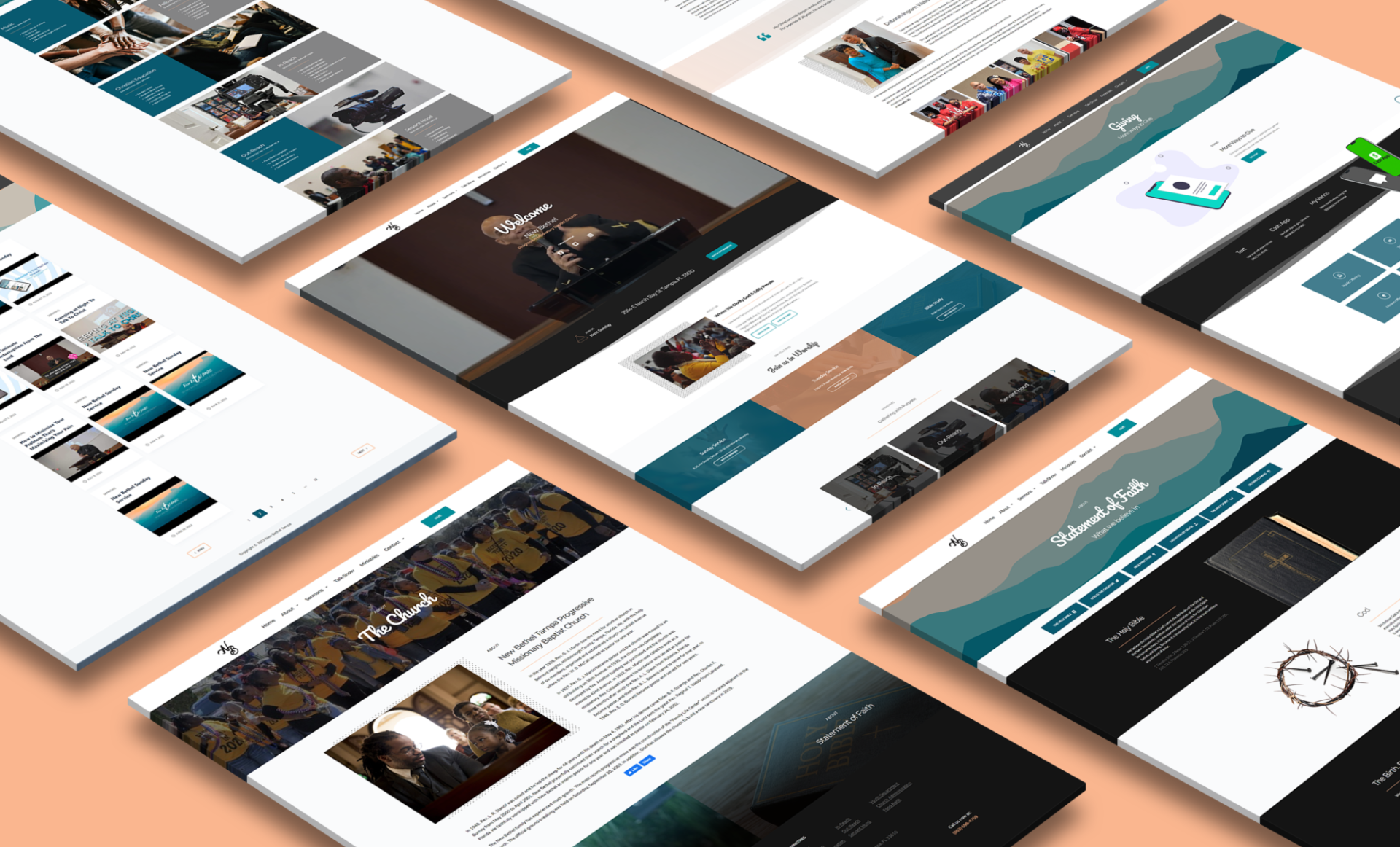
New Bethel was established in 1927 in the heart of Tampa, Florida. Since then, the church has experienced significant growth through the years and their online presence needed an update to reflect those developments and provide a space where members can freely view their posted sermons, lessons, and activities.
Goals
- Create a site map to visualize website navigation
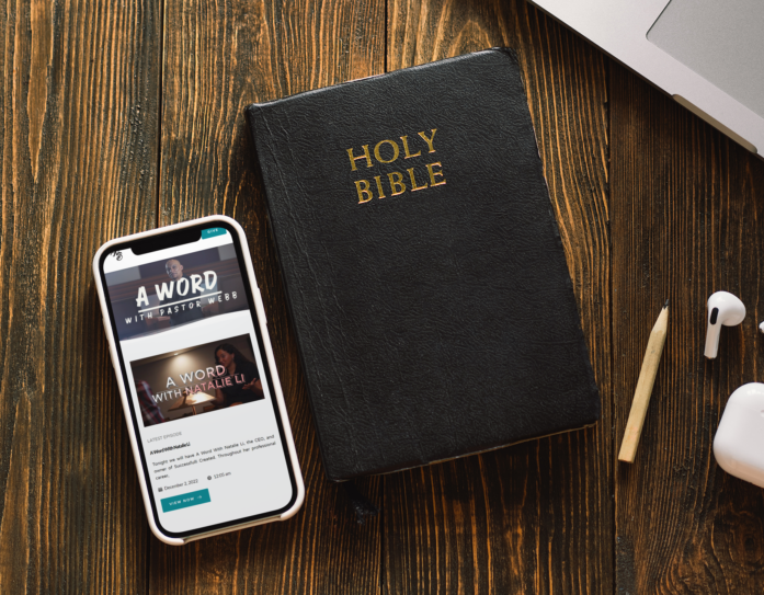
- Sync the church's streamed services, studies, and other media to their website
- Integrate existing tithing system
Before Redesign
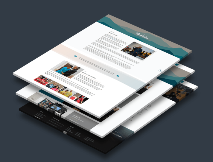
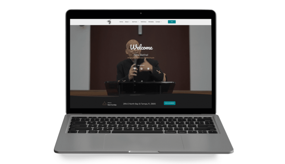
The first step of the process was to consider their original website. Its one-page design was appropriate for its time, however, the church was in need for a multi-page approach that can organize its content and updated branding in a more user-friendly and responsive interface.
Sitemap
Before development, it was important that I walked through the site's navigation with my client. This helped him understand the general hierarchy of the site's pages and subpages.
Low Fidelity Wireframes
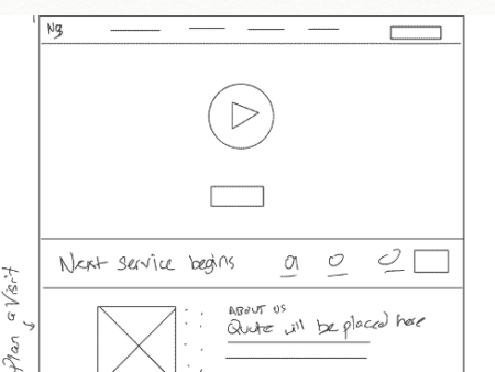
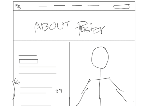
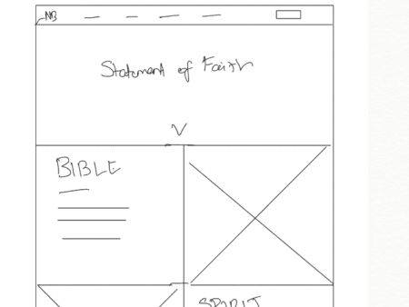
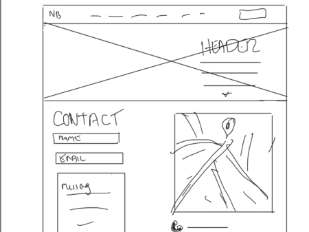
I sketched a general layout of how I'd like the content to look on my iPad. The goal was to communicate to my client the "big idea" and get a consensus of the site's direction. It was important for my client to have subtle movement on each page and a video header for desktop viewers.
Click the images below to enlarge

Updated Branding and logo
Style Guide
The client already had an established identity so it was my goal to integrate their current look with their new site
Viridian Green
#038E99
Primary
Blue Sapphire
#095A70
Shade
Macaroni
#FAB68F
Secondary
Pacifico
Aa Bb Cc Dd Ee Ff Gg Hh Ii Jj Kk Ll Mm Nn Oo Pp Qq Rr Ss Tt Uu Vv Ww Xx Yy Zz
Roboto
Aa Bb Cc Dd Ee Ff Gg Hh Ii Jj Kk Ll Mm Nn Oo Pp Qq Rr Ss Tt Uu Vv Ww Xx Yy Zz
Main Headers
I chose Pacifico because of its relaxed and hand-lettered feel. My client wanted a modern yet friendly style that would target younger or casual viewers. Additionally, this typeface complimented their established branding's style.
Subheaders and Body Copy
Roboto is a geometric sans-serif that has a clean and modern appearance. its versatility and readiblity made it a great option for smaller headlines and body text of different sizes
Iconography
Font Awesome's icon library provided a wide range of options for this project.
