Design | Concept
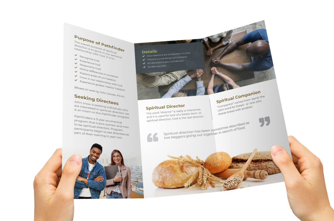
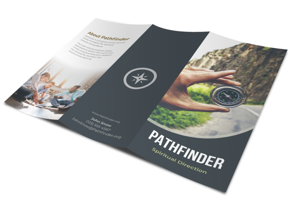
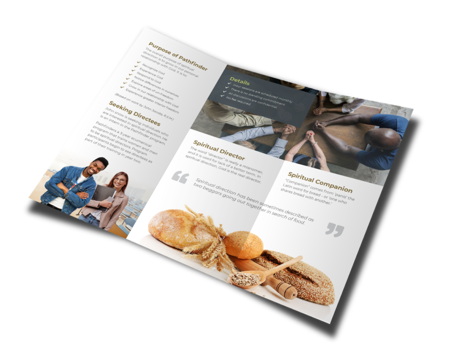
Pathfinder is a concept design based on a fictitious training program that aims to build a solid foundation for those who seek to become spiritual leaders. The idea was based an older design that I hoped to improve its message and imagery.
Goals
- Create a cohesive style guide and moodboard
- Wireframe and plan print layout
- Integrate established style and appropriate imagery
Style Guide & Moodboard
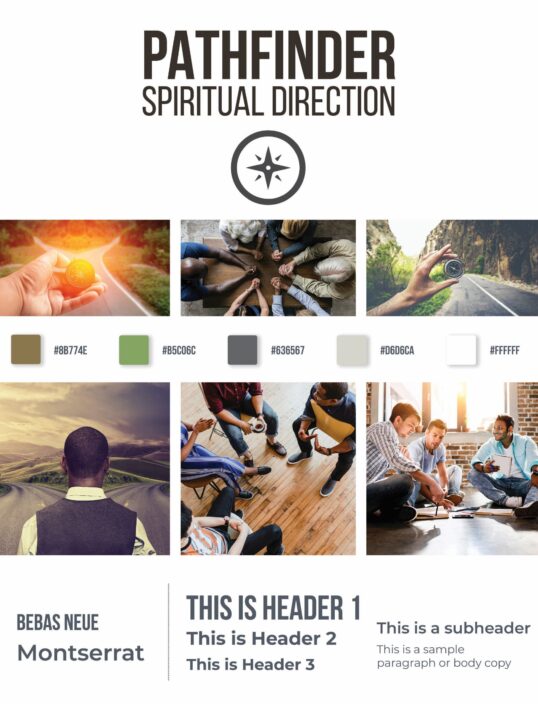
In order to gain an understanding of the target audience, I reviewed several church/spiritual-based websites, color palettes, and the imagery used
While building my moodboard, I focus on several keywords that come to mind when thinking of Pathfinder. These keywords dictated my search phrases, the style, and inspired the final imagery.
- Calm
- Spiritual
- Guidance
- Journey
- Direction
- Mission
- Mentor
- Network
- Compass
- Crossroads
- Map
- Students
The final color palette was directly sampled from the images that were used in the final design. The warm and natural tones invoke warmth, trust, and wisdom - all of which fits the brand.
Natural Brown
Associated with seriousness, wisdom, and religion without feeling too alarming like reds or yellows.
Asparagus Green
Promotes growth, harmony, and tranquility. Also relates to paths and crossroads
Granite Gray
Neutral gray to be used for body copy and headers
Light Gray
Lighter shade of the granite gray to be used for graphics
White Space
Gives the design room to breathe and a clean balance


